Using Drones to Visualize Changes in a Landscape
It has been my goal to document changes in a landscape by using imagery from drones ever since I started using GIS software. Last August (2019) I mapped my first pilot project, a 5 acre meadow in Nevada City using a Mavic Pro. I hope to return to that meadow this coming month to see what changes, if any, are apparent in the preceding year.
This summer after attending the excellent Drone Camp, a week-long training put on by University of California Agriculture and Natural Resources, and purchasing my first drone, a DJI Phantom 4 Pro, I have started to map several forested parcels with family connections.
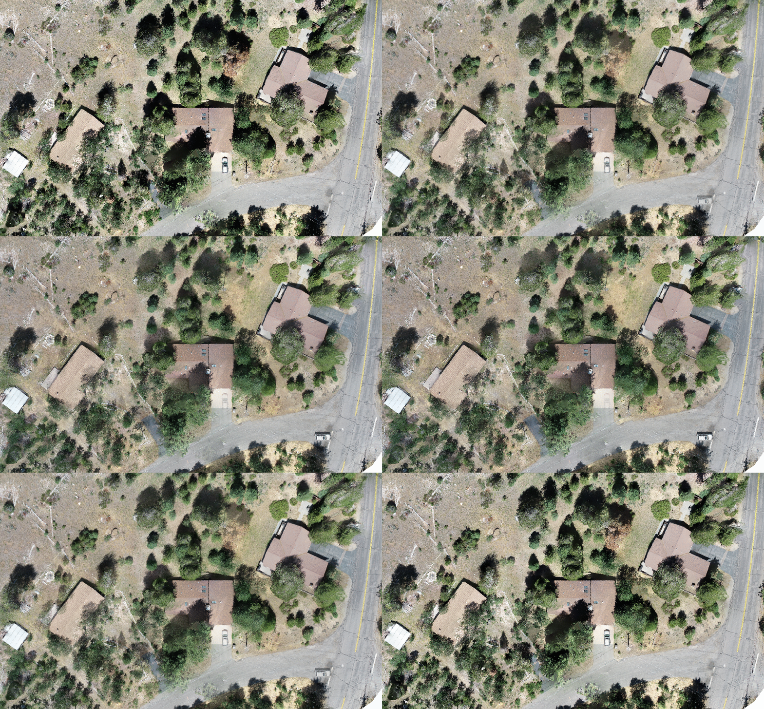
As luck would have it, our families vacation home and neighbors were having some trees removed and I was able to map the parcels before and after the tree work was completed. The above image is a “birds-eye” comparison of the parcels on July 11th and 21st. Like a “spot the difference” game from the Sunday comics page of the newspaper, this image allows us the viewer to visualize the tree removal project. How many removed trees can you count?
A virtue of using drones for image collection is the ability to collect high resolution images and the ease of repeating flights. In my last post about collecting photos of the Upper Truckee River, I showed a screenshot of the flight path used for that project. Identical flightpaths can be reflown, allowing for images from nearly the same vantage point (notice the slight variation in photo location in the examples below due to GPS variance). By flying this site at nearly the same time and ten days apart, shadow length and position were consistent to allow for better analysis.
After processing the images using Open Drone Map, I had two nearly identical orthomosaics to compare. Remember that slight variation in GPS observed in the images above? Without access to high accuracy GPS equipment to record Ground Control Points, my orthomosaics won’t line up perfectly in a GIS application like QGIS or ESRI’s ArcMap or ArcGIS Pro. For my applications, that’s not a big concern as I can use tools built in to those apps to shift one or more orthomosaic layers so they line up. In the example above (and below) I used three features to shift and adjust the newer orthomosaic to line up with the first. On the right side of the map, I used the manhole in the road, while on the left side of the map I used the shed and firepit. With the images lined up, I exported to photoshop to match the colors in each image and then create a gif to visualize the tree work completed.
Voila! An end product with no legend required can be a useful tool for illustrating progress on a project.
In my next post I’ll discuss how to use the RGB (color) values in these photos to classify vegetation and create site maps. If you have any questions or comments, please get in touch using the contact form in the navigation menu!


